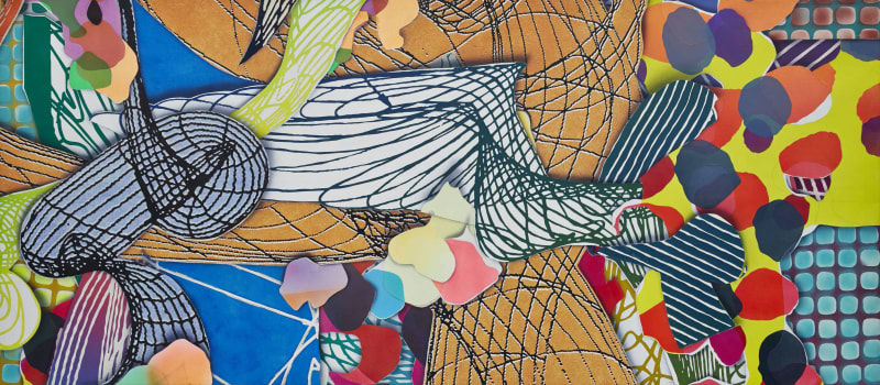
Hooloomooloo segment, 1992 (detail)
Mixed medium on canvas
137 x 60 x 2 1/2 inches
348 x 152.4 x 6.4 cm
BY KAREN WILKIN
Is Frank Stella the most audacious, surprising printmaker working today? The answer is yes, based on visiting “Frank Stella Unbound: Literature and Printmaking,” at the Princeton University Art Museum, a survey of four series of this always-experimental artist’s most important (and most experimental) visually and technically remarkable prints, made between 1984 and 1999. Conceived to commemorate Mr. Stella’s 60th Princeton reunion—he’s Class of 1958—the show was organized by the Princeton Museum curators Mitra Abbaspour and Calvin Brown, who, with doctoral candidate Erica Cooke, also contributed to the informative catalog.
The exhibited prints are all monumental and deploy diverse, unexpected, sophisticated methods, along with collaging and hand-coloring. All are named for literary works: “Had Gadya,” a time-honored Passover song published in 1919 as a book illustrated by the Russian Constructivist El Lissitzky; Italo Calvino’s “Italian Folktales”; Herman Melville’s “Moby-Dick,” with a nod at a 1930 edition illustrated with black-and-white woodcuts by Rockwell Kent; and “The Dictionary of Imaginary Places,” by Alberto Manguel and Gianni Guadalupi. Mr. Stella’s prints are supplemented by relevant editions of the source works, including Lissitzky’s and Kent’s illustrations, and a 19th-century French treatise on rendering three-dimensional forms that offers a key to some of Mr. Stella’s recurring motifs.
Literary associations notwithstanding, the exhibition’s prints are all uncompromisingly abstract. They read as collapsed versions of Mr. Stella’s raucous, energetic constructed paintings of the 1980s, with their projecting, open-work layers, graffiti-like passages, and glitter. Whatever their connection to particular texts, the prints are ultimately about passionate orchestrations of saturated, unpredictable hues, patterns, scribbles and textures. Far from illustrating his sources, Mr. Stella says his aim was to “tell a story with the shapes.” In the “Had Gadya” (1984) series, for example, cones and cylinders, with crisp, graduated striping that suggests stylized shading, appear in different configurations in all the prints—abstract equivalents, perhaps, of the song’s linked verses: “Then Came a Dog and Bit the Cat; Then Came a Stick and Beat the Dog; Then Came a Fire and Burnt the Stick,” and so on.
But we seek specific allusions at our peril. Rapid scrawls of orange on angular shapes appear in images related to the dog, an ox, water and “the Holy One, Blessed Be He,” but not in the one about fire. And Mr. Stella tells us that he decided to reread “Moby-Dick” only after starting to use what he calls a “wave shape” that “began to look like a whale,” following time spent watching Beluga whales at an aquarium. Reading the book, Mr. Stella says, made him think that “it would be great to use the chapter headings of the novel for the titles of the pieces.”
The “Had Gadya” series was published by Waddington Graphics, London, and while the prints are notably adventurous combinations of hand-coloring and hand-cut collage with lithograph, linocut and screenprint, they seem restrained compared with the other cycles, which were produced at the legendary, no longer extant Tyler Graphics, in Mount Kisco, N.Y., where just about anything was possible. Kenneth Tyler, the master printer, founder and director, loved a challenge, which allowed Mr. Stella to be even more uninhibited and daring than usual—which is saying a lot. “Italian Folktales” (1988-89), “The Moby Dick Prints” (1989-93) and the “Imaginary Places” (1994-99) combine lithography, etching, aquatint, relief, engraving, screenprinting, linoleum block, hand-coloring, marbling, collaging, woodcut, collagraph, stamping, and I’m probably omitting something.
The orchestration of methods is remarkable, and so is the “kit of parts” of repeated motifs. Mr. Stella, who has always eagerly embraced technological possibilities, constructed many of his compositions with sheets of Ben-Day dots derived from reproductions of his own paintings, enlarged until they became ample splotches of process red, blue and yellow (as colored inks were called before digital printing). Other patterns derive from snow fences, doilies, smoke rings and other unlikely phenomena, sometimes photographed, manipulated and used as springboards for drawing or collaging. Mr. Stella invented some elements and scavenged, appropriated, recycled, or repurposed others—including configurations from his own paintings. Some prints incorporate metallic relief; others, called “Domes,” bulge toward us without interrupting the image.
The installation explains these technical elaborations for those who want clarification, while examples of different stages of some prints further reveal Mr. Stella’s working methods. But the dazzling pyrotechnics are always in the service of potent aesthetic ideals. The images in the four cycles range from relatively spare, centralized motifs against loosely patterned backgrounds to all-stops-out, densely packed, pulsing extravaganzas, animated by lively tonal and chromatic contrast.
Mr. Stella’s trenchant writings make clear his admiration for the 17th-century master Caravaggio’s theatrically lighted dramas, paintings whose spatial audacity seems to inform Mr. Stella’s projecting constructed works and, by implication, his prints at the Princeton Museum. The richness and complexity of the four exhibited cycles make it tempting to read them as contemporary manifestations of the High Baroque, filtered through a street-smart sensibility. A trip to Princeton is highly recommended.
